
Small Rooms, Considered Choices: Decorating Principles That Create the Illusion of Space

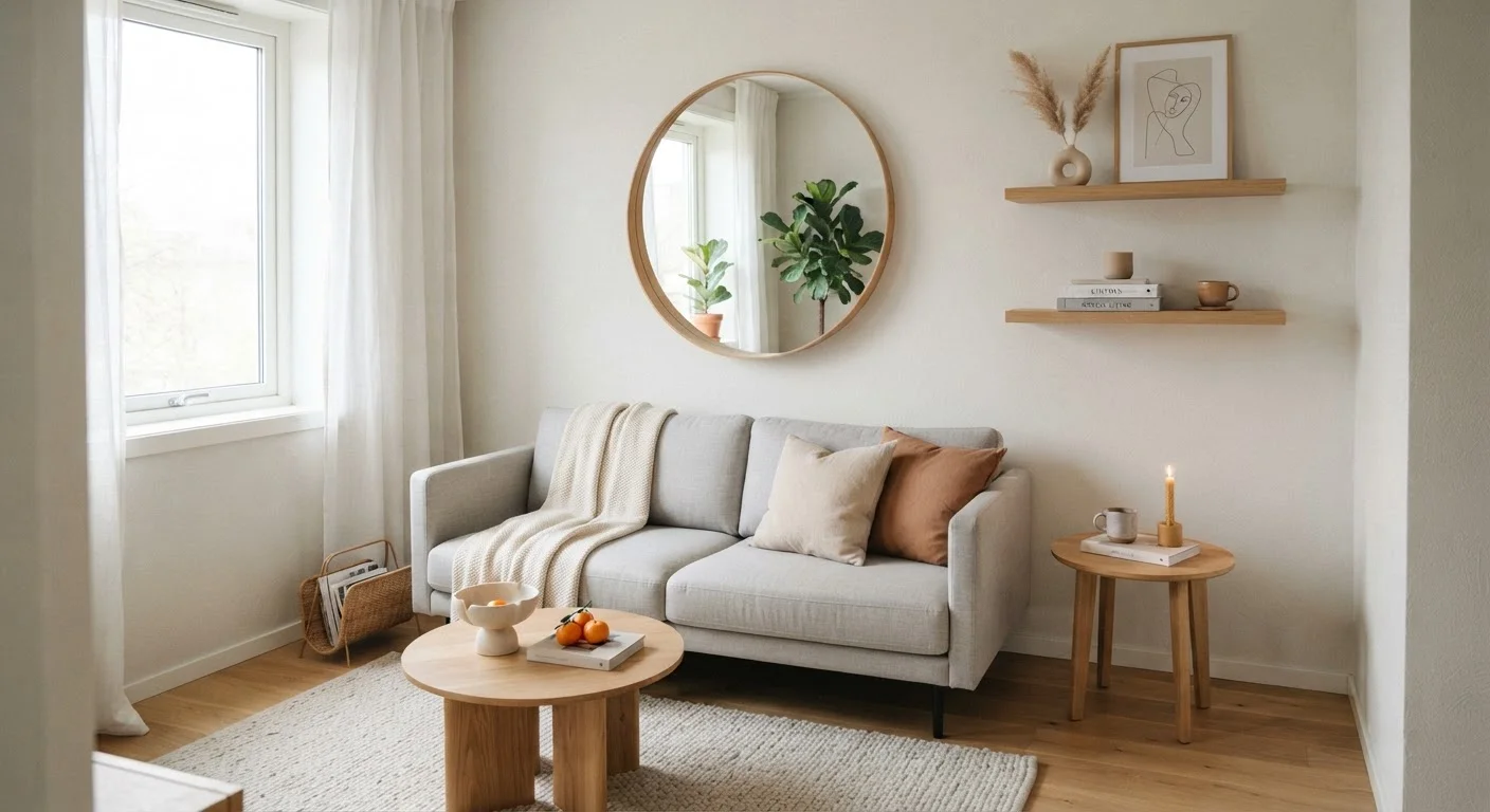
Scale, light, and layout decisions can make a compact room feel remarkably airy. Here's what actually works and why.
Key takeaways
- Light, cohesive color palettes visually expand walls and ceilings without structural changes.
- Furniture scale matters more than quantity — one well-proportioned piece beats three cramped ones.
- Mirrors and layered lighting are two of the most effective tools for amplifying perceived space.
- Vertical storage draws the eye upward and frees valuable floor area.
- Keeping visual noise low — through consistent materials and limited accent colors — makes rooms feel calmer and larger.
Why Small Rooms Feel Smaller Than They Are
Square footage tells only part of the story. A compact room that's well-lit, cohesively decorated, and thoughtfully arranged can feel genuinely airy. A larger room crammed with mismatched furniture and inconsistent lighting can feel oppressive. The gap between how a room measures and how it feels comes down to a handful of design variables that are entirely within your control.
The principles here aren't tricks or illusions in a superficial sense — they're grounded in how visual perception actually works. The brain infers spatial size from cues like continuous color fields, unobstructed sight lines, and light distribution. Work with those cues, and a small room begins to feel like a considered, complete space rather than a compromise. For anyone starting from scratch, the interior decorating fundamentals guide offers a solid foundation before diving into small-space specifics.
Color, Scale, and the Visual Logic of Space
Color is the fastest lever you can pull. A cohesive, light-leaning palette — carried across walls, trim, and large furnishings — allows the eye to travel without interruption. Contrast is the enemy of perceived size: every sharp tonal shift signals a boundary, and boundaries shrink rooms. That doesn't mean every room must be white. Even mid-tone palettes can feel spacious when the values stay close to one another. (For a compelling case that darker walls can work in small spaces too, see our piece on why dark walls are less scary than you think.)
Scale is equally critical — and more commonly mishandled. The instinct to buy smaller furniture for a small room is right in principle but often executed incorrectly: people buy several small pieces rather than fewer, better-proportioned ones. A room with three undersized chairs and two small side tables looks busier, not bigger. Choose fewer pieces, let each one breathe, and prioritize furniture with visual lightness — open legs, slender profiles, transparent materials like glass or acrylic.
Choose a cohesive, light-leaning color palette and carry it through the whole room.
When walls, trim, and large furnishings read as a unified tonal family, the eye moves continuously rather than stopping at contrasting edges. This makes boundaries between surfaces feel less abrupt, softening the sense of enclosure. Light values — warm whites, soft greiges, pale sage — reflect more of the available daylight back into the room.
Select furniture scaled to the room, not to an aspirational larger space.
Oversized furniture is one of the most common reasons small rooms feel suffocating. When pieces are appropriately proportioned, pathways open up, the room breathes, and individual pieces look intentional rather than crammed. Aim for at least 30–36 inches of clearance on major traffic paths.
Use mirrors deliberately to borrow light and depth from adjacent areas.
A well-placed mirror creates the impression of a second window or an extended sight line, especially when positioned to reflect a light source or a view. This works because the brain interprets reflected depth as actual space — a well-documented visual perception principle.
Pull furniture away from walls to create breathing room and actual depth.
The instinct to push everything against the perimeter to 'save space' often backfires — it creates a flat, room-wide gap in the center that reads as unused rather than open. Floating furniture even a few inches from walls creates layers and makes the room feel more curated and three-dimensional.
Build storage vertically to reclaim floor area.
Tall bookshelves, wall-mounted cabinetry, and high-hung shelving draw the eye upward — a compositional move that heightens the perceived ceiling line — while keeping horizontal floor space clear. Cleared floors are one of the clearest signals to the eye that a room is spacious.
Layer lighting to eliminate dark zones and create visual breadth.
A single overhead fixture casts a concentrated pool of light that makes the surrounding areas recede into shadow, emphasizing the room's edges. Multiple light sources at different heights — floor lamp, table lamp, wall sconce — dissolve those shadowed corners and make the room feel expansive and complete.
Light and Layout: The Two Biggest Multipliers
Natural light is non-negotiable. Keep window treatments simple and high-hung — curtain rods mounted close to the ceiling with floor-length panels make walls feel taller and let maximum light in. Avoid heavy valances or thick layered treatments that eat into the window opening.
Artificial lighting deserves the same attention. A single overhead fixture is one of the most common causes of a room that feels smaller than it is — it creates a bright center zone and shadowed perimeter, which the brain reads as edges closing in. Layered lighting from multiple sources at different heights eliminates those shadows and gives the room a sense of expansive warmth. Our companion article on lighting layers goes deeper on this approach.
Layout decisions are just as high-impact. Floating furniture off walls, maintaining clear traffic paths, and using mirrors to extend sight lines are all strategies that work within the existing footprint. If the room still feels visually cluttered after these moves, the visual clutter diagnostic guide can help identify what's actually causing the noise.
Renting? These principles still apply.
Most of the strategies here — furniture placement, mirror placement, lighting layers, color choices — work in rented homes without touching a wall permanently. For paint and hardware ideas that won't cost you your deposit, see our guide on decorating a rental without losing your deposit.
Storage, Surfaces, and the Art of Restraint
Vertical storage is one of the most underused tools in a small room. Wall-mounted shelving and tall cabinetry do double duty: they draw the eye upward — raising the perceived ceiling line — while keeping the floor clear. Cleared floors read as spacious floors. The trade-off between open shelving and closed cabinetry is worth thinking through carefully; our guide on open shelving vs. closed cabinetry breaks down the visual and practical differences in detail.
Surface restraint matters just as much as storage strategy. In a small room, every object is visible from almost everywhere — which means decorative clutter compounds quickly. A useful rule: edit decorative objects to the point where removing one more feels like a loss. That's the right density. Group objects in odd numbers, vary heights, and keep the palette of materials consistent. The room refresh checklist offers a structured way to audit any surface for what's earning its place.
All published content on this website is for informational and educational purposes only and should not be taken as professional advice. We recommend that readers seek expert opinion before making any decisions. The website is not responsible for any actions taken based on the information provided on this website. We are not liable for any inaccuracies, modifications, or omissions in information. Moreover, external links or third-party content are provided for convenience; we are not liable for their correctness. Users are advised to verify every piece of information before they use it for any purpose.