
From Bare Walls to a Considered Home: Interior Decorating for Absolute Beginners

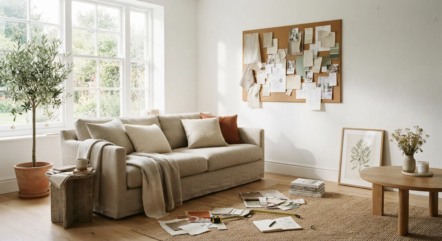
Never decorated a room before? Start here. A grounded introduction to the core ideas, tools, and decisions every first-timer faces.
Start here
Why Decorating Feels Overwhelming (And Why It Doesn't Have To)
Build your foundation
Start With What You Already Know You Like
Learn the rules
The Core Principles Every Room Needs
Make key decisions
Colour: The Decision That Shapes Everything
Arrange your space
Furniture, Scale, and Arrangement
Complete the picture
Finishing Touches: Texture, Light, and the Small Stuff
Key takeaways
- Good decorating starts with understanding your own preferences, not copying a magazine spread.
- Every room benefits from a clear focal point, balanced proportions, and a limited colour palette.
- Paint is one of the most affordable and impactful changes you can make to any room.
- Scale matters: oversized furniture shrinks a room; undersized pieces make it feel unfinished.
- Layering texture and light is what separates a flat room from one that feels genuinely warm.
- You don't need to decorate everything at once — intentional, phased decisions produce better results.
Why Decorating Feels Overwhelming (And Why It Doesn't Have To)
Most people don't struggle to decorate because they have bad taste. They struggle because the starting point is genuinely unclear. Should you choose the paint colour first, or the sofa? Does everything need to match? What even is a "style"? The options feel infinite, and the fear of making an expensive mistake keeps many people stuck with bare walls for years.
Here's a grounding thought: decorating is a skill, not an innate talent. It has learnable principles, and those principles are more straightforward than the design industry often suggests. This guide doesn't ask you to know your aesthetic before you start — it helps you figure it out as you go. You'll also find that most decisions are more reversible than they seem. Pillows, art, rugs, and even paint are all changeable. What you're building first is a framework, not a permanent statement.
Focal point
The dominant element in a room that draws the eye first — such as a fireplace, large window, or statement piece of furniture. Everything else in the room is arranged in relation to it.
Colour temperature
A measure of how warm (yellow/orange) or cool (blue/white) a light source appears, measured in Kelvins (K). Lower numbers like 2700K produce warm, amber light; higher numbers like 5000K produce bright, cool light.
Negative space
The intentionally empty areas in a room — open wall sections, clear floor space, uncrowded surfaces. Negative space gives the eye somewhere to rest and prevents a room from feeling cluttered.
60-30-10 rule
A colour-balancing guideline where 60% of the room uses a dominant colour, 30% uses a secondary colour, and 10% uses an accent colour. It creates variety while keeping the room visually cohesive.
Visual balance
The quality of a room feeling equally weighted on all sides. It doesn't require perfect symmetry — a large piece on one side can be balanced by a cluster of smaller items on the other.
Proportion
The size relationship between objects in a room — furniture to room size, lamp to table, artwork to wall. Good proportion means no single element feels too large or too small for its surroundings.
Mood board
A collection of images, colour swatches, fabric samples, and material references assembled before decorating a room. It helps you spot patterns in your preferences and make cohesive decisions.
Start With What You Already Know You Like
Before you look at a single paint chip or furniture catalog, spend time with what you already respond to. Scroll back through saved images on your phone. Pull out items in your home that you've never wanted to get rid of. Notice the clothes you reach for most — people often dress and decorate in surprisingly consistent ways.
Look for patterns across those preferences. Do you gravitate toward muted, earthy tones or clean, bright contrasts? Do you prefer clean lines or curved, organic shapes? Rough textures like linen and wood, or smooth surfaces like lacquer and glass? These preferences — not a named style or trend — are your real starting point. To understand how named styles map to these underlying qualities, our plain-English guide to decorating styles can help you put a label on what you're drawn to.
Collect a simple reference document — a folder of saved images, a physical mood board, even a small pile of magazine pages — before you spend a single dollar. This reference will prevent impulse decisions and give you something to return to when choices feel difficult.
The Core Principles Every Room Needs
Good rooms aren't accidents. They share a few structural qualities that you can apply deliberately, regardless of your style preference.
- A focal point. Every room should have one element the eye is drawn to first — a fireplace, a large window, a statement piece of art, or a bed in a bedroom. Arrange everything else in relation to it.
- Visual balance. Balance doesn't mean symmetry. It means the room doesn't feel heavier on one side than the other. A large dark sofa on the left can be balanced by a cluster of objects — lamp, plant, art — on the right.
- Proportion and scale. Objects and furniture should be sized appropriately for the room and for each other. A tiny rug under a large sectional makes the whole arrangement feel unmoored.
- Negative space. Empty areas give the eye somewhere to rest. Filling every surface makes a room feel anxious, not layered. Leave breathing room between objects and furniture.
These four qualities — focal point, balance, proportion, and negative space — underpin almost every decorating principle you'll encounter at a more advanced level. If a room feels off but you can't identify why, running through this checklist will usually surface the issue. Our room refresh checklist walks through this evaluation in practical detail.
Colour: The Decision That Shapes Everything
Colour is the single most transformative — and most anxiety-inducing — decision in decorating. A few principles will make it significantly less daunting.
The 60-30-10 rule is a reliable starting structure. Assign 60% of the room to a dominant colour (typically walls and large upholstery), 30% to a secondary colour (curtains, accent chairs, a rug), and 10% to an accent (throw pillows, artwork, small objects). This ratio creates visual variety without chaos.
Neutral doesn't mean boring. White, cream, warm grey, greige, and soft taupe are neutral because they work with almost everything — not because they're safe choices by default. A warm ivory wall and a charcoal linen sofa is a colour decision, even if neither is vivid.
If you're drawn to darker, more dramatic shades, don't let conventional wisdom talk you out of them entirely. Deep greens, navy, and charcoal can make a room feel anchored and sophisticated when used thoughtfully. See our guide to dark walls for a grounded look at how to use them well.
Always test paint on the actual wall — at least a 12-inch square — and observe it in both daylight and artificial light before committing. Colour shifts dramatically across different light conditions.
Sample Before You Commit
Paint colours look dramatically different on a wall than they do on a small chip or a screen. Before purchasing a full gallon, buy sample pots and paint at least a 12-by-12-inch swatch directly on the wall. Live with the sample for a few days, checking it in morning light, afternoon sun, and under your usual evening lighting. Only then decide.
Furniture, Scale, and Arrangement
Most beginner decorating mistakes happen at the furniture stage. The two most common: choosing pieces that are too small for the room, and pushing all furniture against the walls in an attempt to create space. Both produce the same result — a room that feels empty and unconnected.
Start by measuring your room and sketching a rough floor plan on grid paper. Mark where doors, windows, and outlets are located. Then decide on your focal point and build the furniture arrangement around it, working outward. In a living room, that typically means the seating faces or flanks the focal wall or fireplace, with a rug large enough to sit under at least the front legs of every major piece.
Allow traffic lanes of roughly 30–36 inches between furniture pieces — enough to walk comfortably without squeezing. If the room is genuinely small, our article on decorating small rooms addresses the specific scale and layout decisions that help compact spaces feel larger.
Before buying anything, use painter's tape on the floor to map the footprint of proposed furniture. This simple step prevents expensive mistakes.
Finishing Touches: Texture, Light, and the Small Stuff
A room with good bones but no layering looks like a showroom — complete but uninviting. Texture and light are what make a room feel genuinely lived-in and warm.
Texture is introduced through soft goods (a chunky knit throw, a jute rug, linen curtains), hard materials (a wooden side table, a ceramic lamp base, a rattan basket), and art or wall treatments. Rooms that use only one material type — all smooth, all rough, all soft — feel flat. Contrast is what creates visual interest.
Lighting is often the most underestimated element in a beginner's plan. Overhead lighting alone produces a harsh, one-dimensional effect. Layer in floor lamps, table lamps, and directional accent lighting — and put as many fixtures on dimmers as your space allows. Warm bulbs (in the 2700–3000K color temperature range) are almost always more flattering for living spaces than cool white options.
For the smaller decisions — art placement, shelf styling, plant selection — give yourself permission to move slowly. Adding one considered thing at a time produces better results than filling a room all at once. If you're ready to take on a specific decorating project, our room-by-room decorating framework provides a more detailed, structured approach for working through each space in your home.
Frequently Asked Questions
All published content on this website is for informational and educational purposes only and should not be taken as professional advice. We recommend that readers seek expert opinion before making any decisions. The website is not responsible for any actions taken based on the information provided on this website. We are not liable for any inaccuracies, modifications, or omissions in information. Moreover, external links or third-party content are provided for convenience; we are not liable for their correctness. Users are advised to verify every piece of information before they use it for any purpose.