
The Language of Colour: How Paint Choices Shape the Mood of a Room

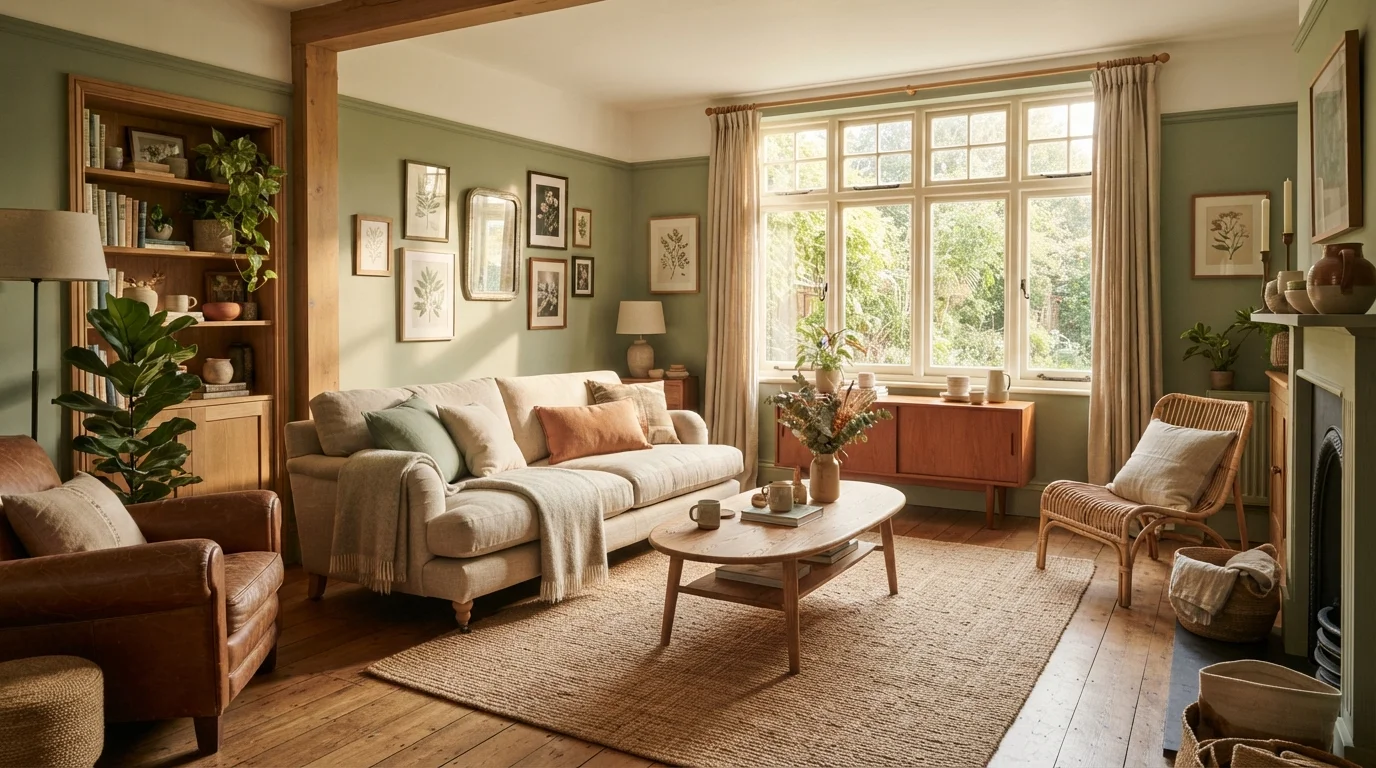
Explore how colour psychology influences the atmosphere of your home and what to consider before picking up a paintbrush.
Key takeaways
- Warm hues like reds and oranges tend to stimulate energy and conversation, making them well-suited to social spaces.
- Cool blues and greens are widely associated with calm and focus, often recommended for bedrooms and home offices.
- Undertones matter as much as the base colour — a 'white' with pink undertones reads very differently from one with grey undertones.
- Natural light dramatically shifts how any colour appears throughout the day; always test paint samples in the actual room.
- Saturation and value (lightness or darkness) of a colour influence a room's perceived size and intimacy.
- There are no universally 'correct' paint choices — personal response and room function should guide your decisions.
Why Colour Is More Than Decoration
Walk into a room painted deep navy and notice how it feels different from one washed in pale lemon — even before you register a single piece of furniture. That reaction isn't accidental. Colour carries psychological weight that operates below our conscious awareness, influencing how warm, energised, anxious, or at ease we feel in a space.
Interior designers have long drawn on colour psychology to guide decisions that are grounded in both human perception research and practical experience. The concept doesn't promise that a certain blue will guarantee restful sleep or that yellow will make you happier — individual responses vary considerably. What it does offer is a reliable framework for understanding why certain colour families tend to produce predictable effects, and how to use that knowledge intentionally when painting a room.
For anyone working through a broader decorating project, the room-by-room decorating framework positions colour as one piece of a larger system — interconnected with proportion, lighting, and material choices rather than existing in isolation.
The Colour Families and Their Common Associations
Understanding colour in broad families is a practical starting point. Here's how each major group tends to function in residential interiors:
- Reds and oranges (warm, advancing colours): These hues are stimulating and appetite-promoting, which is why they appear so frequently in dining rooms and kitchens. They tend to make spaces feel energetic and social. Used at full saturation in a small room, they can feel overwhelming; muted terracotta or soft coral tones deliver warmth without intensity.
- Yellows: Associated with optimism and mental clarity, yellow works well in spaces that need brightening — particularly north-facing rooms with limited natural light. Rich, saturated yellows can feel jarring in large quantities; creamy or ochre tones are typically easier to live with long-term.
- Blues: Among the most frequently recommended colours for bedrooms and bathrooms, blue is associated with calm, trust, and focus. Lighter blues feel airy and clean; deeper navy or slate create a sense of intimacy and sophistication.
- Greens: Sitting at the intersection of warm and cool, green is one of the most versatile colours for interior use. Sage, olive, and forest tones feel grounded and restorative — qualities that suit living rooms, home offices, and bedrooms equally.
- Purples and violets: These convey creativity and contemplation. Lavender is a popular choice for bedrooms seeking a gentle, restful quality; deeper plums add drama in accent walls or smaller spaces like powder rooms.
- Neutrals (white, grey, beige, black): Neutrals form the backbone of most interior colour schemes. They recede and allow furnishings and art to take focus. The critical skill here lies in understanding undertones — a warm greige behaves completely differently from a cool grey, even if both appear 'neutral' on the chip.
90 sec
Time for colour to influence first impressions
Research in environmental psychology suggests that people form initial judgements about a space within seconds, with colour playing a significant role in that rapid assessment.
~62–90%
Share of product assessment attributed to colour alone
According to research published in the journal Management Decision, colour accounts for a large proportion of how people evaluate objects and environments on first exposure.
Blue
Most commonly preferred colour globally
Cross-cultural studies on colour preference consistently find blue ranks highest in stated preference across diverse populations, though interior context shapes how it's applied.
The Variables That Change Everything
Colour doesn't exist in a vacuum — it's in constant conversation with the room around it. Three variables in particular can transform how a paint colour reads in your space:
Natural and Artificial Light
A colour swatch under fluorescent store lighting will look dramatically different in a south-facing living room at noon, or in a lamplit bedroom at night. North-facing rooms receive cool, indirect light that can make blues feel grey and greys feel cold. South-facing rooms get warmer light that flatters earthy tones and enriches saturated colours. Test paint samples — applied directly to the wall — at multiple times of day before making a final decision. Understanding how light interacts with colour and finish is explored in depth in the guide on what paint sheen does to light and space.
Saturation and Value
Saturation refers to a colour's intensity — how vivid or muted it is. Value describes how light or dark it is. A deep, highly saturated colour will make a room feel more enclosed and dramatic; a pale, desaturated version of the same hue keeps it feeling open. Adjusting saturation rather than switching hues entirely is a useful way to moderate a colour's impact.
The Role of Adjacent Colours
The colours of your flooring, furniture, cabinetry, and fixed fixtures all influence how a wall colour reads. A warm oak floor pulls warm undertones out of a paint colour; cool grey tile does the opposite. If repainting without replacing other elements, bring fabric swatches and flooring samples when reviewing paint options.
If colour altogether feels too risky a move, it's worth knowing that texture can do similar atmospheric work in a room that stays intentionally neutral.
Matching Colour to Room Function
The way a room is used should shape your colour decision as much as your aesthetic preferences. A home office where you need to sustain concentration calls for different colour energy than a dining room designed for lively gathering.
Test Before You Commit
Paint at least two large swatches (ideally 12 inches square) directly on the wall and observe them at different times of day and under both natural and artificial light before purchasing full quantities. Many paint retailers offer small sample sizes specifically for this purpose. Living with a sample for two to three days gives you a far more reliable read than a chip card ever can.
As a practical orientation:
- Bedrooms: Prioritise calm. Desaturated blues, greens, lavenders, and warm neutrals support a restful atmosphere.
- Home offices: Soft greens and muted blues are associated with focus and reduced visual fatigue. Avoid high-stimulation reds or very bright yellows if you need sustained concentration.
- Kitchens and dining rooms: Warm tones — terracotta, sage, golden yellows, soft reds — create conviviality and complement food presentation.
- Living rooms: These rooms need to flex between daytime activity and evening relaxation, so medium-value neutrals, warm whites, and versatile greens tend to hold up across contexts.
- Bathrooms: Watery blues, clean whites, and soft greens reinforce a sense of cleanliness and calm.
Your decorating style also sets parameters for colour selection. Interior design styles decoded can help you identify which colour palettes are consistent with the aesthetic you're working toward. And because colour and lighting layers are so tightly linked, it's worth treating both as part of the same decision rather than separate afterthoughts.
Frequently Asked Questions
All published content on this website is for informational and educational purposes only and should not be taken as professional advice. We recommend that readers seek expert opinion before making any decisions. The website is not responsible for any actions taken based on the information provided on this website. We are not liable for any inaccuracies, modifications, or omissions in information. Moreover, external links or third-party content are provided for convenience; we are not liable for their correctness. Users are advised to verify every piece of information before they use it for any purpose.