
Texture Over Colour: The Underused Tool That Transforms Neutral Rooms

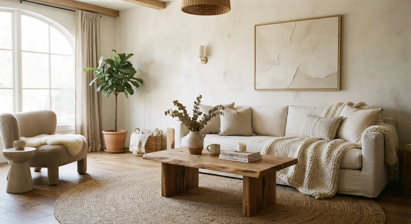
When colour feels too risky, texture quietly does the heavy lifting. Learn how layering materials adds life to a restrained palette.
Key takeaways
- Texture creates visual interest in neutral rooms without introducing bold colour.
- Combining matte and reflective surfaces adds dimension that a single finish cannot.
- Natural materials like linen, jute, wool, and raw wood each carry distinct tactile value.
- Layering textures at different scales — from a chunky rug to a fine-weave cushion — prevents a room from feeling flat.
- Lighting amplifies texture: raking light across a textured wall reveals depth invisible under overhead light.
Why Neutral Rooms Fail — and What's Actually Missing
A neutral palette is one of the most popular starting points in American homes — and one of the most commonly misunderstood. Beige, greige, white, and warm off-white walls feel safe, but without further thought they can slide into something else entirely: flat, forgettable, and vaguely institutional.
The instinct when a room feels lifeless is to reach for colour — an accent wall, a colourful sofa, a bold piece of art. But the diagnosis is often wrong. What the room is missing isn't colour. It's contrast — and in a neutral scheme, texture is how you deliver it.
Colour contrast draws the eye horizontally, from one saturated surface to another. Texture contrast works differently: it creates depth within a single surface or material, engaging the eye more subtly. A linen curtain and a velvet cushion can share the same warm ivory tone and still read as entirely distinct elements. That distinction is what makes a neutral room feel considered rather than cautious. See how colour choices shape mood if you want to understand why texture and colour work as complementary tools rather than substitutes.
Understanding the Two Types of Texture
Before you can layer texture well, it helps to understand what you're working with. Interior designers distinguish between two categories:
- Tactile texture — the physical surface quality of a material. Think the ridges on a rattan basket, the pile of a wool rug, or the roughness of a limewash wall. You can feel it with your hand, and it also reads visually.
- Visual texture — depth or pattern that the eye perceives as textured even though the surface may be flat. A linen-look wallpaper, a herringbone tile floor, or a tightly printed woven pattern all create the impression of texture without always having physical dimension.
In practice, the most successful neutral rooms combine both. Physical texture gives a room warmth and authenticity; visual texture adds pattern and rhythm without the commitment of colour. Together they create what designers call material richness — the sense that a room has been thoughtfully assembled rather than quickly furnished.
Texture and Paint Sheen Are Related
The sheen level of paint — flat, eggshell, satin, or semi-gloss — is itself a form of surface texture. A flat finish absorbs light and reads as soft and matte; a satin finish reflects light and creates a smoother, more modern surface. Varying sheen between surfaces in the same neutral colour is one of the subtlest and most effective ways to introduce textural contrast. Learn how paint sheen affects light and space for a deeper look at this often-overlooked variable.
How to Layer Textures Without Losing Coherence
The risk with texture is the same as with pattern: too much of it, applied without logic, creates visual chaos. The goal is contrast that feels intentional. A practical framework is to work across three scales:
- Large-scale texture — walls and floors. A limewash or Venetian plaster finish on a single wall reads as a subtle, shifting texture that changes with light. A wide-plank wood floor with visible grain, or a looped jute rug, sets a tactile foundation for everything above it.
- Mid-scale texture — upholstery and window treatments. A sofa in a nubby bouclé fabric, linen drapes with a visible slub weave, or a boucle or waffle-weave ottoman introduce tactile contrast at furniture scale.
- Small-scale texture — cushions, throws, vessels, and objects. A chunky knit throw over a smooth linen arm, a hammered brass bowl beside a smooth ceramic vase, or a rough-edged woven cushion against a flat pillow cover — these details complete the layering.
The unifying element across all three scales should be colour. Keep the palette tight — two or three tonal values of the same hue — so the eye registers the textural differences as richness, not noise. This approach dovetails naturally with a room-by-room decorating framework that sequences decisions from large to small.
The Role of Light in Revealing Texture
Texture and light are inseparable. A textured surface in flat, overhead light looks almost identical to a smooth one. The same surface under a raking side light — from a table lamp, a wall sconce, or natural light entering at a low angle — reveals every ridge, weave, and variation in depth.
This is why a limewash wall that photographs beautifully at dusk can look disappointingly flat under a ceiling fixture. It's also why thoughtful lighting design isn't a finishing touch — it's an integral part of making texture work. Understanding how ambient, task, and accent lighting interact is one of the fastest ways to bring textured surfaces to life.
Practically: position table lamps and floor lamps so their light grazes textured surfaces rather than falling flat onto them. Wall sconces flanking a plaster or limewash wall will cast shadows that animate the surface throughout the day. In rooms with limited natural side light, this kind of deliberate placement becomes even more important.
Materials That Do the Most Work in a Neutral Palette
Not all textures carry equal visual weight. In a neutral scheme, the following materials consistently deliver the most contrast and warmth:
- Linen — the slub weave of natural linen catches light unevenly, creating subtle variation even in a plain fabric. It reads as casual and considered simultaneously.
- Raw or oiled wood — visible grain, especially in wider planks or rough-hewn forms, grounds a room with organic warmth that no paint colour can replicate.
- Plaster and limewash finishes — these wall treatments have natural variation in tone and surface that shifts with the light, making a plain wall feel alive.
- Woven naturals — jute, sisal, seagrass, and rattan introduce tightly structured pattern through their weave alone, requiring no colour to register as a distinct textural note.
- Matte ceramics — an unglazed or matte-finish ceramic vessel reads very differently from a shiny one in the same colour, demonstrating how finish alone creates textural contrast.
Mixing materials from different origins — plant-based fibres alongside stone, metal alongside wood — also adds what designers sometimes call material tension: a productive contrast of origin and character that prevents a room from feeling like a catalogue display. This same principle drives the appeal explored in mixing antiques with contemporary pieces.
Start With One Textured Surface
If layering feels overwhelming, begin with a single change: replace a smooth synthetic rug with a natural-fibre alternative, or swap out flat cotton cushion covers for a linen or waffle-weave version. One deliberate textural addition often reveals where the next one belongs. Build from there rather than changing everything at once.
Frequently Asked Questions
All published content on this website is for informational and educational purposes only and should not be taken as professional advice. We recommend that readers seek expert opinion before making any decisions. The website is not responsible for any actions taken based on the information provided on this website. We are not liable for any inaccuracies, modifications, or omissions in information. Moreover, external links or third-party content are provided for convenience; we are not liable for their correctness. Users are advised to verify every piece of information before they use it for any purpose.